I was hooked with the list of simple advice. But, there is a lot more here to read and consider.
From the post (link follows):
If you are too busy to read this post in full, follow this short list of guidelines and you’ll be on your way to producing elegant visualizations that impose a minimal cognitive burden on your audience:
- Never represent something in 2 or (god forbid) 3 dimensions if it can be represented in one—NEVER use pie charts, 3-D pie charts, stacked bar charts, or 3-D bar charts.
- Remove as much chart junk as possible–unnecessary gridlines, shading, borders, etc.
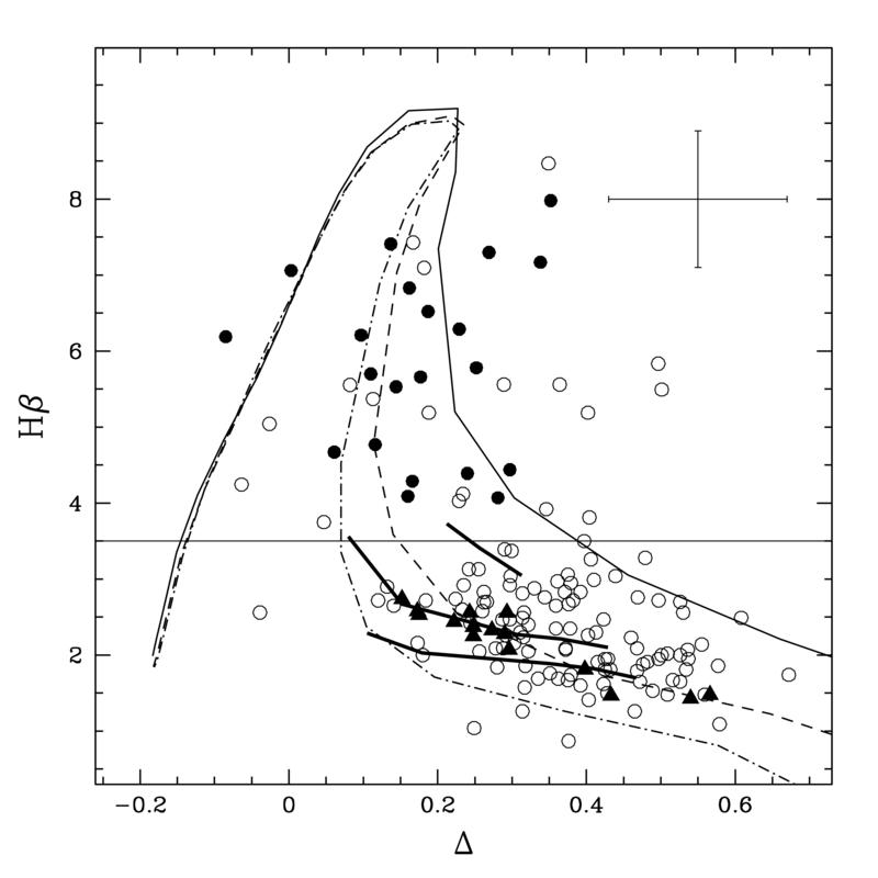
- Give your audience a sense of the noise present in your data–draw error bars or confidence bands if you are plotting estimates.
- If you want to plot multiple types of groups on a single outcome (the visual analog of cross-tabulations/marginals), use multi-paneled plots. These can also help ifoverploting looks too cluttered.
- Avoid mosaic plots. Instead use paneled histograms.
- Ditch the legend if you can (you almost always can).
?action=AttachFile&do=get&target=hp_sex_smoker_free_free.png)
http://solomonmessing.wordpress.com/2012/03/04/visualization-series-insight-from-cleveland-and-tufte-on-plotting-numeric-data-by-groups/
No comments:
Post a Comment